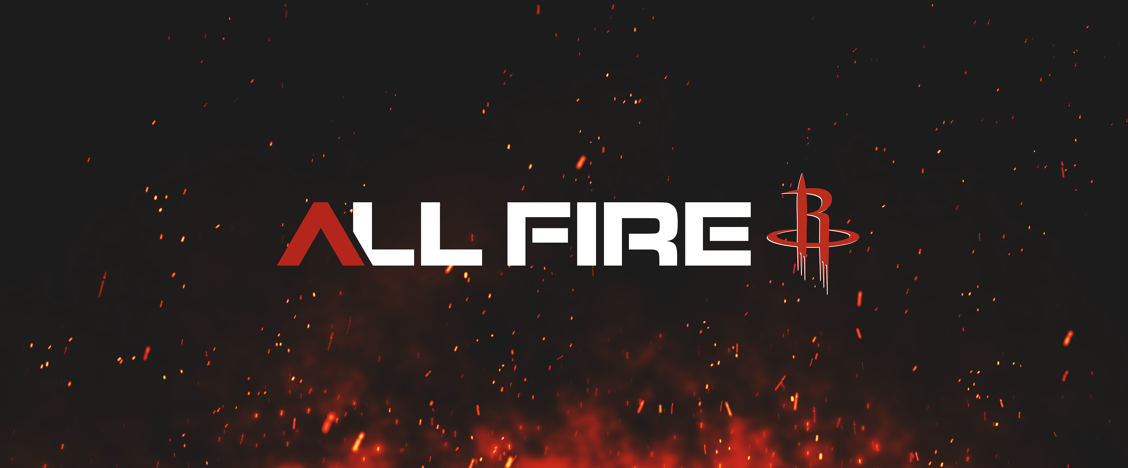
25-26 All Fire Campaign
Logo Design and Branding
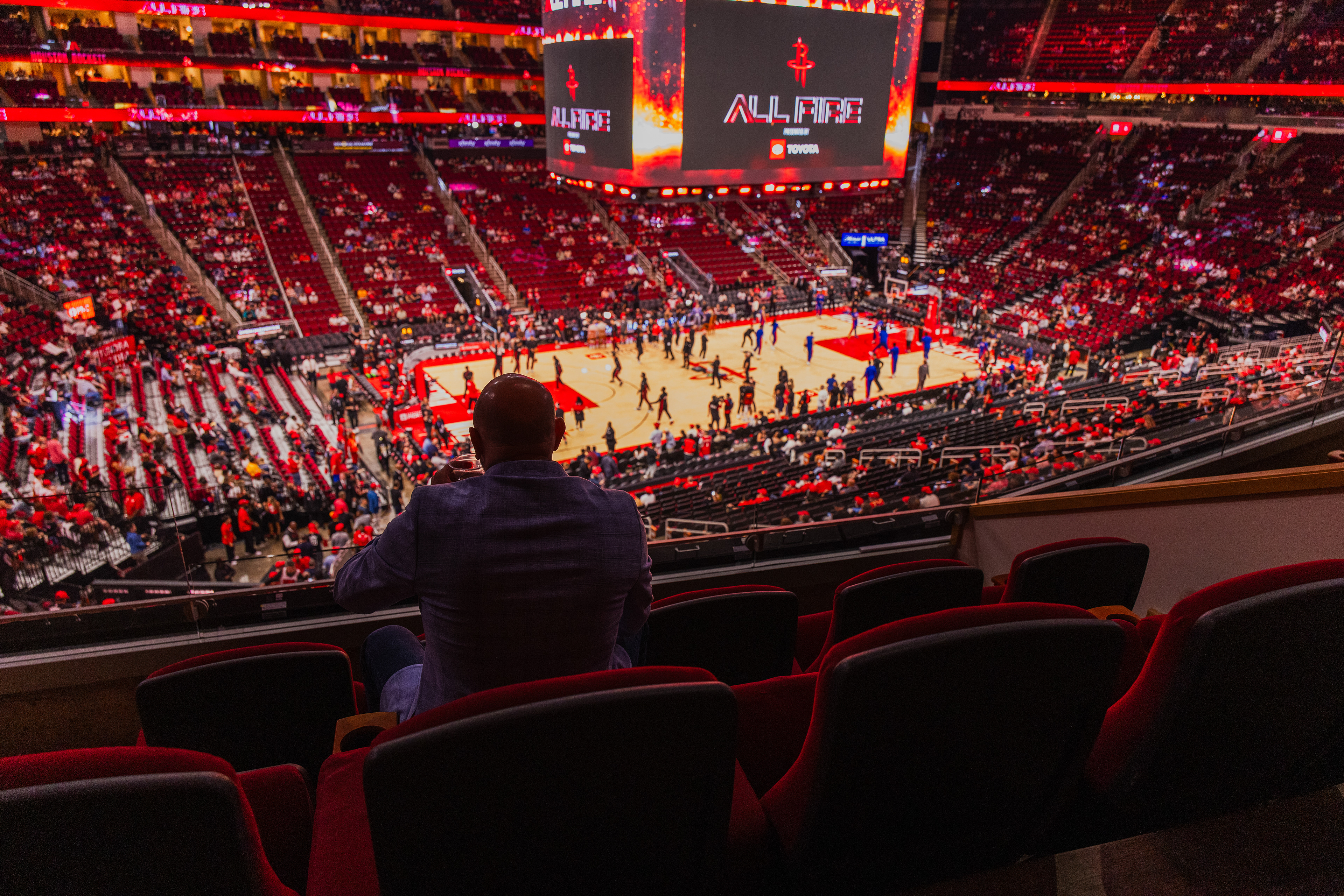
OVERVIEW
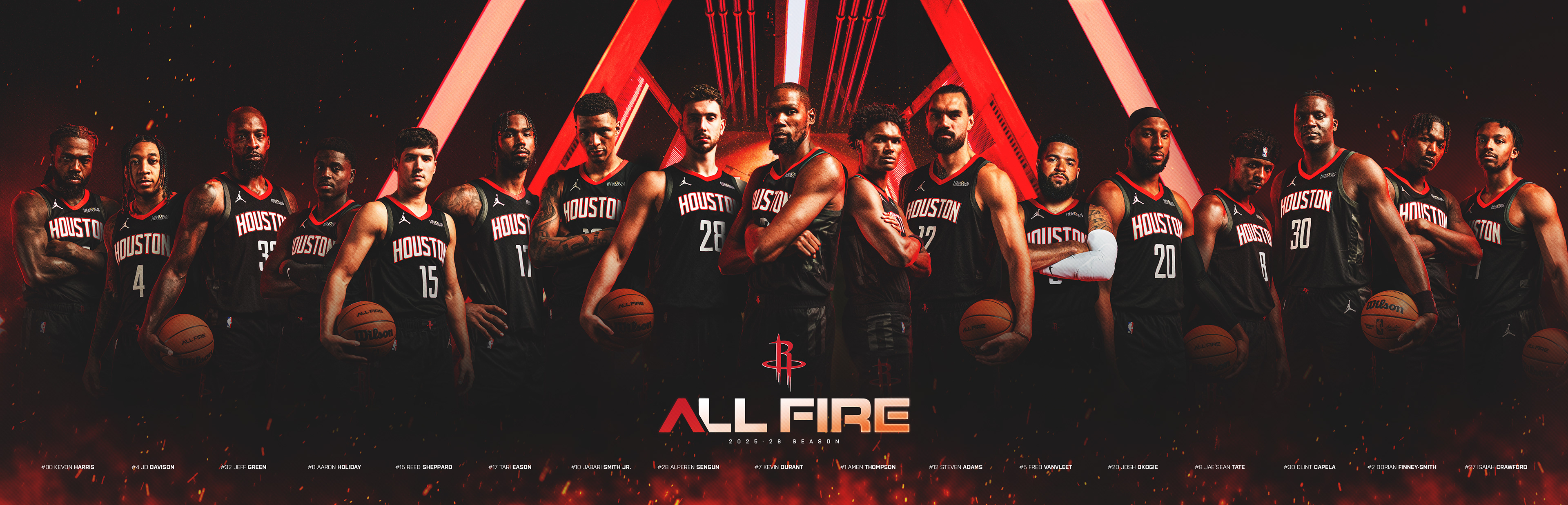
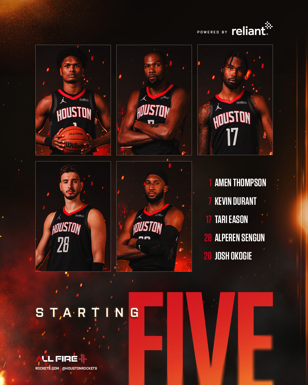
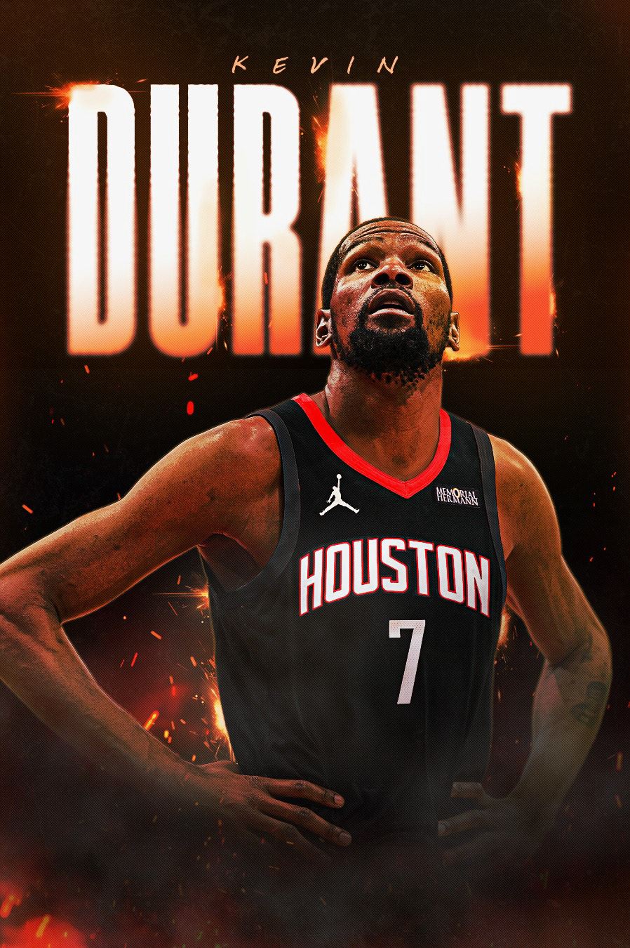
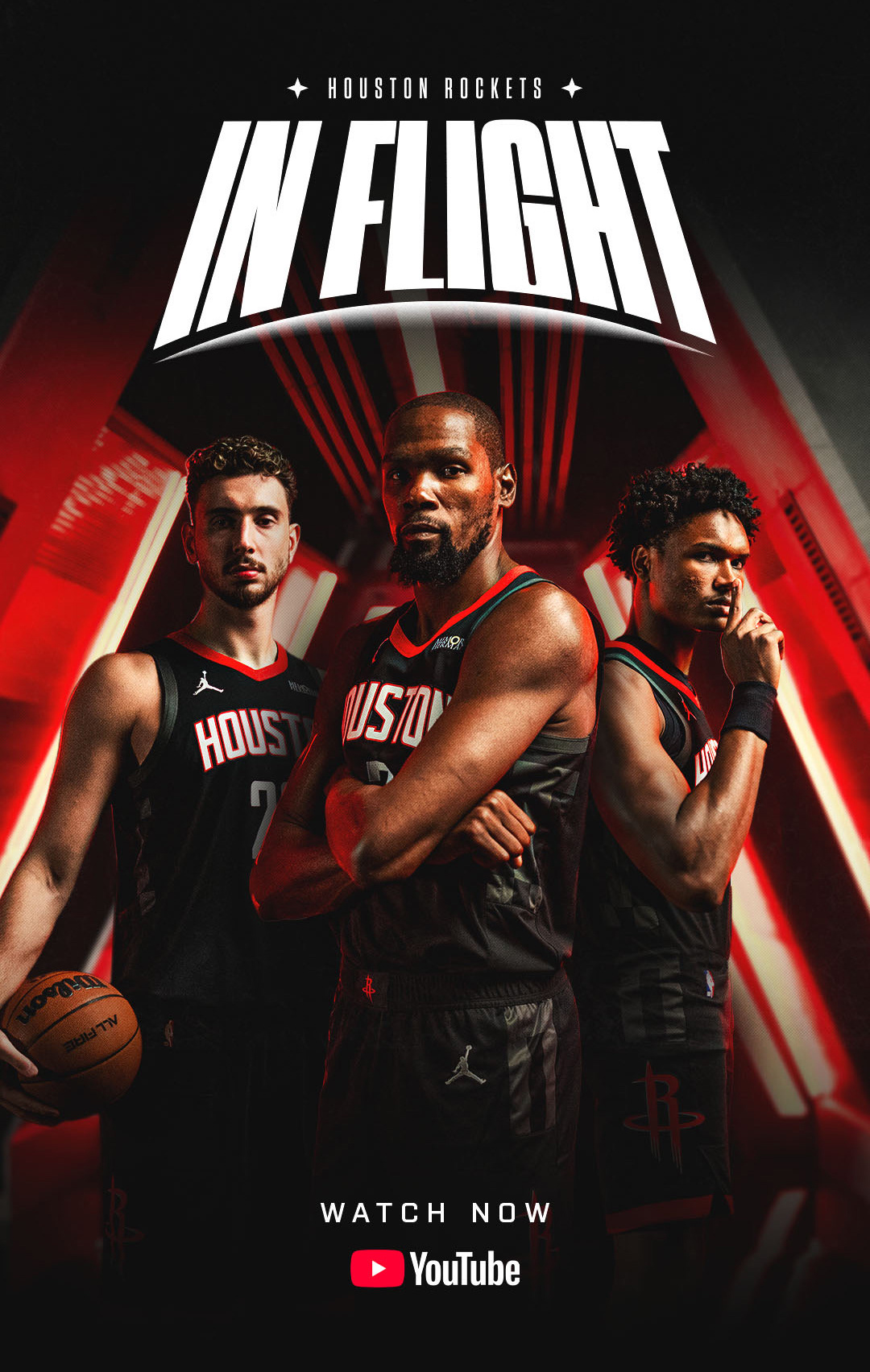
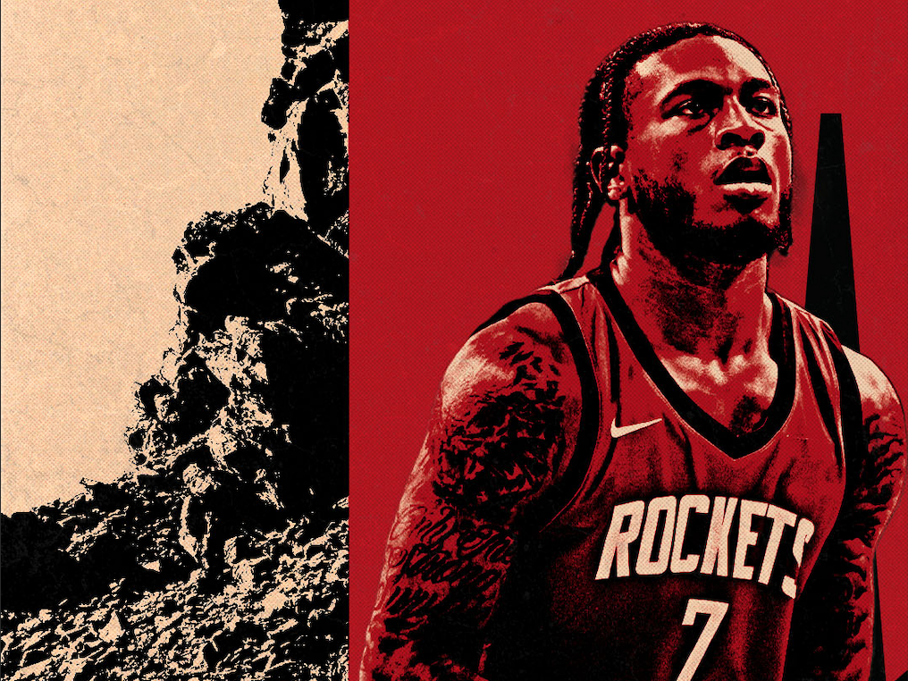
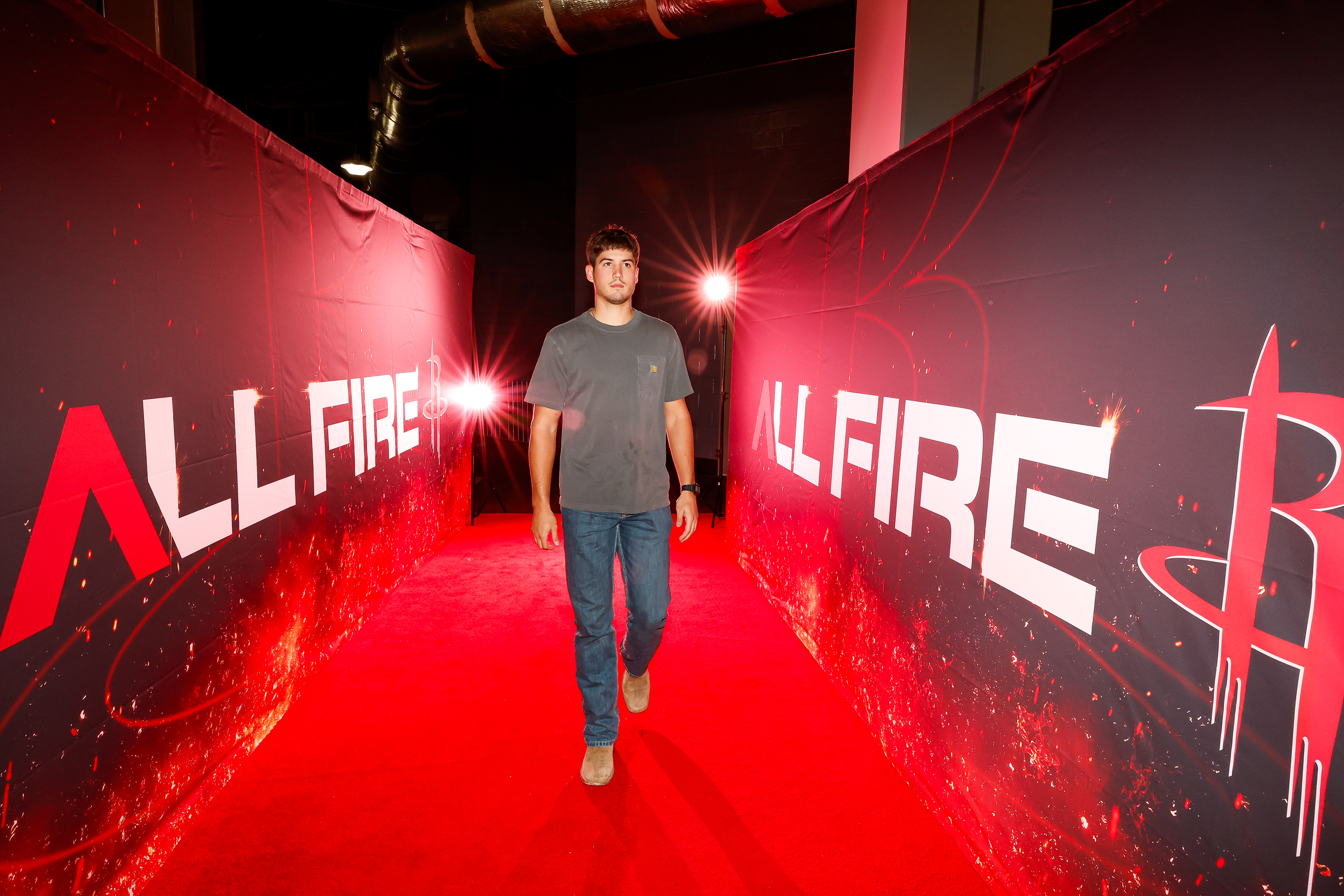
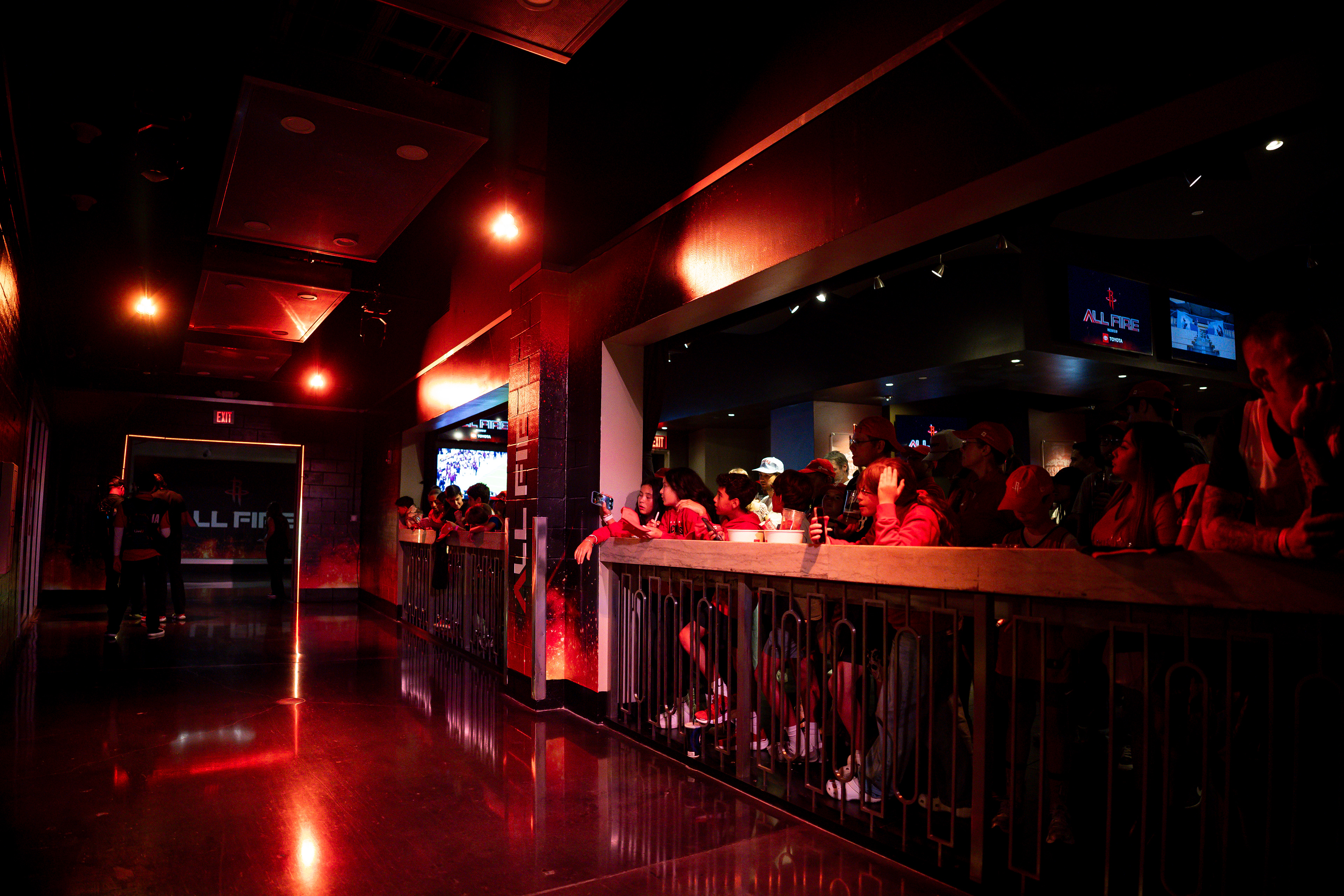
This season, we aimed to move beyond the narrative of a rebuild and instead highlight the talent and athleticism of our fiery team. All Fire represents strength, resilience, and the momentum of a championship-caliber roster. The campaign sets the tone for the entire season, appearing across advertising, print, social media, apparel, and throughout the Toyota Center.
APPROACH
Our previous campaign, Liftoff, had run its course, and we knew it was time for something new. We began by developing a new logo inspired by the ascension, intensity, and heat of our team, as well as our battle-driven journey toward the playoffs. From there, we returned to our roots with a bold use of red, shifting away from a repetitive space theme and into a more dynamic, fiery battleground.
AAF Houston - Gold Addy Award
All Fire Logo Design
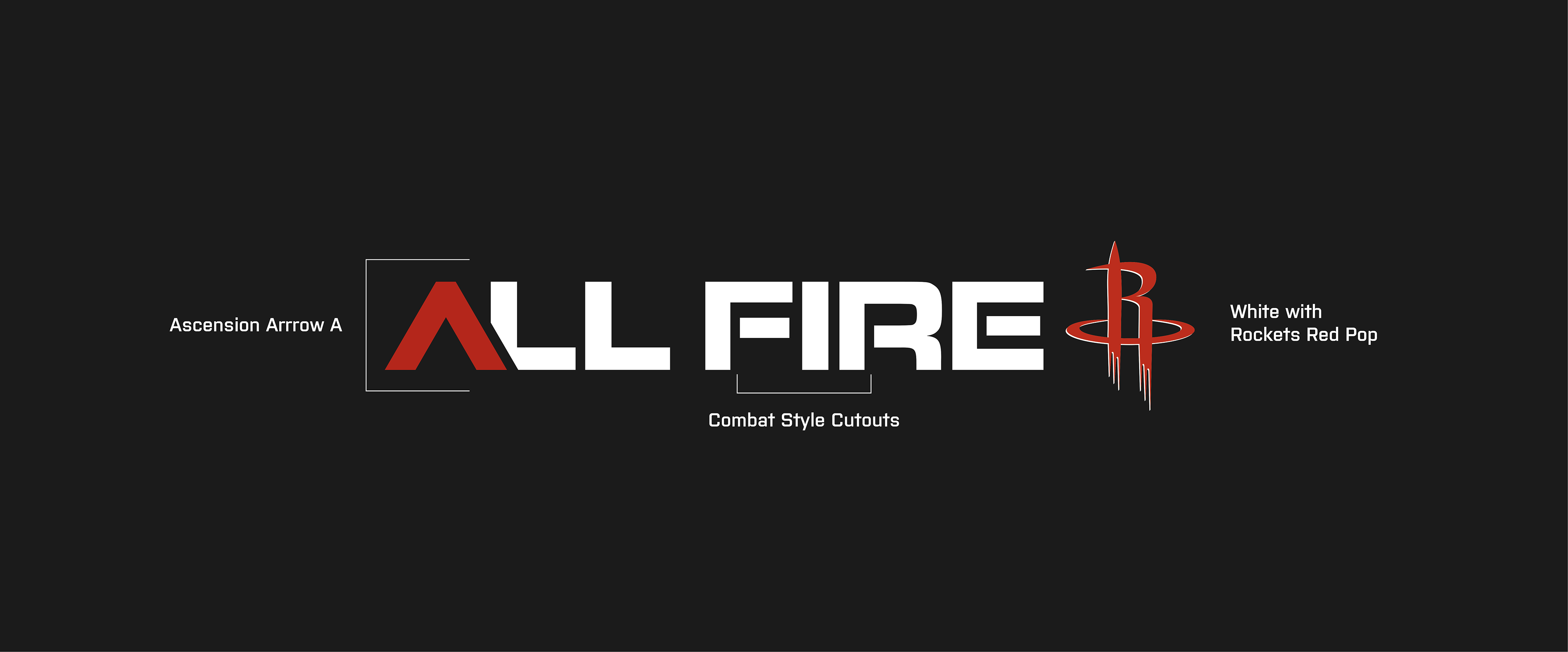
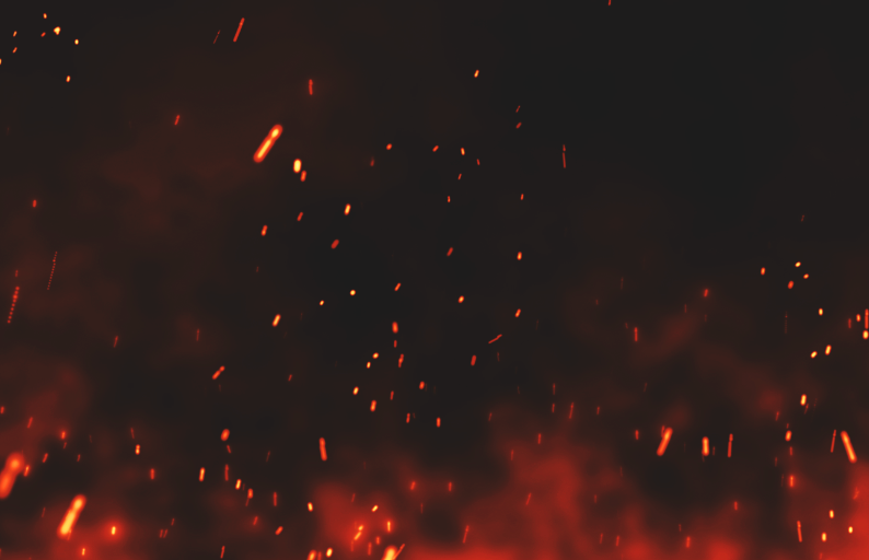
GRAPHIC ELEMENTS
Utilizing various fiery elements we were able to capture the heat and resilience of the team.


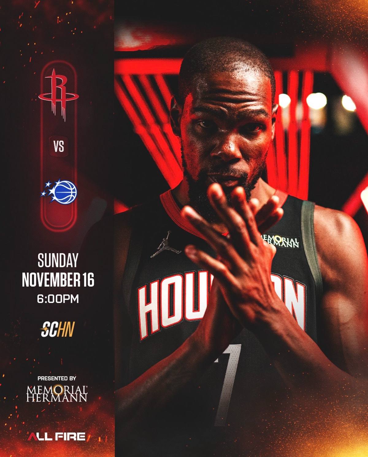
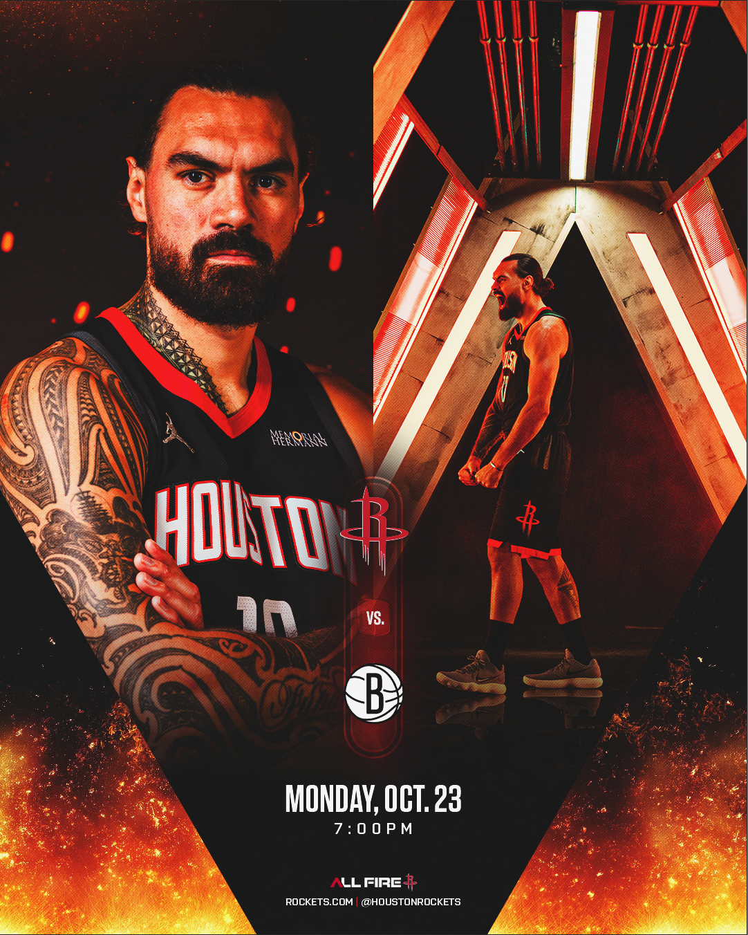
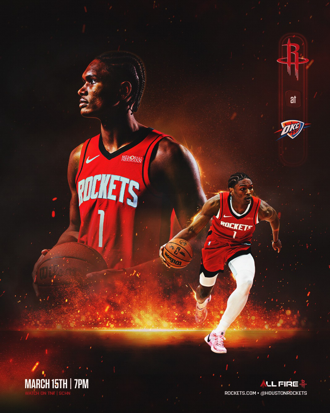
MATCHUP GRAPHICS
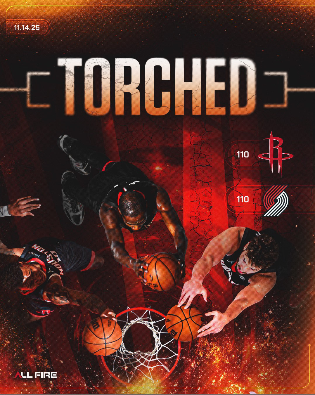
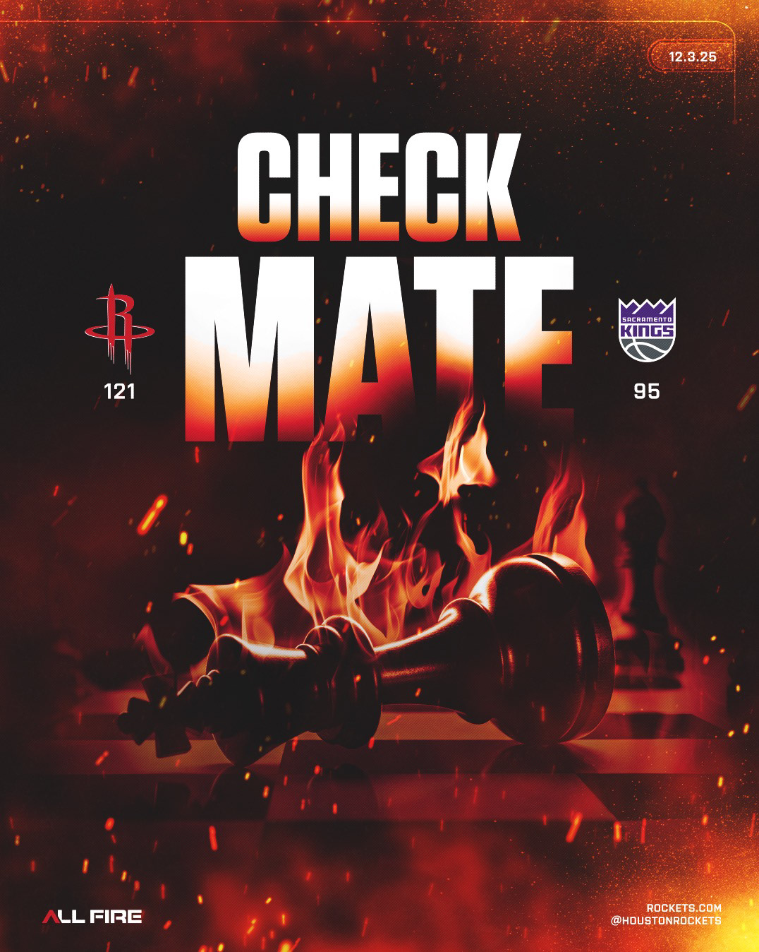
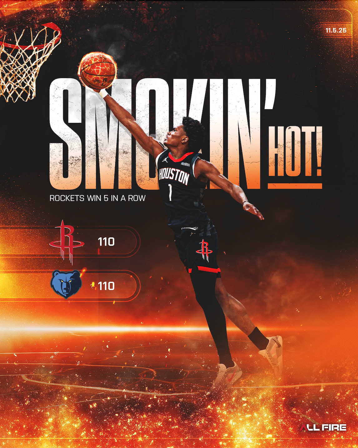
WIN GRAPHICS
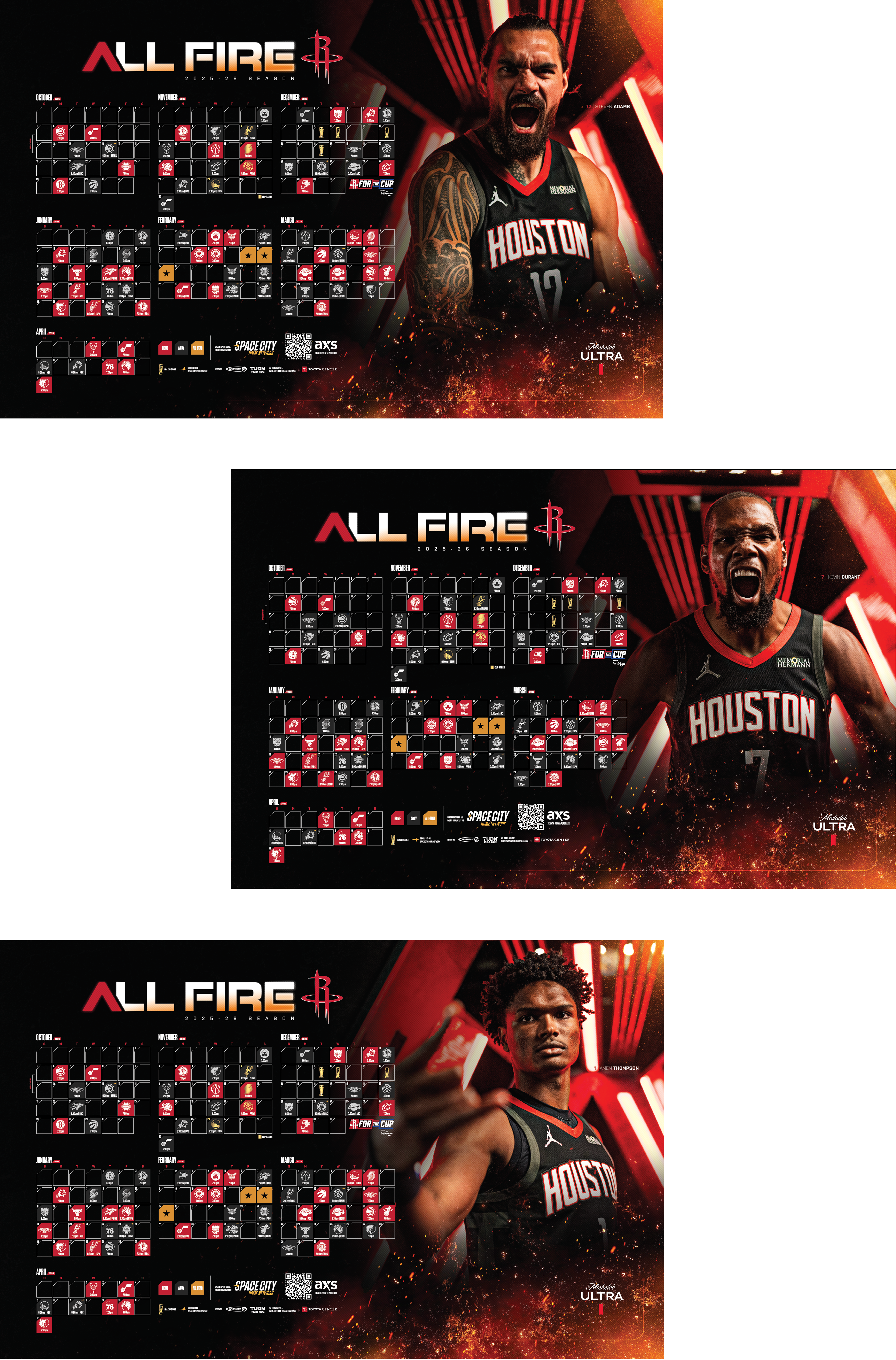
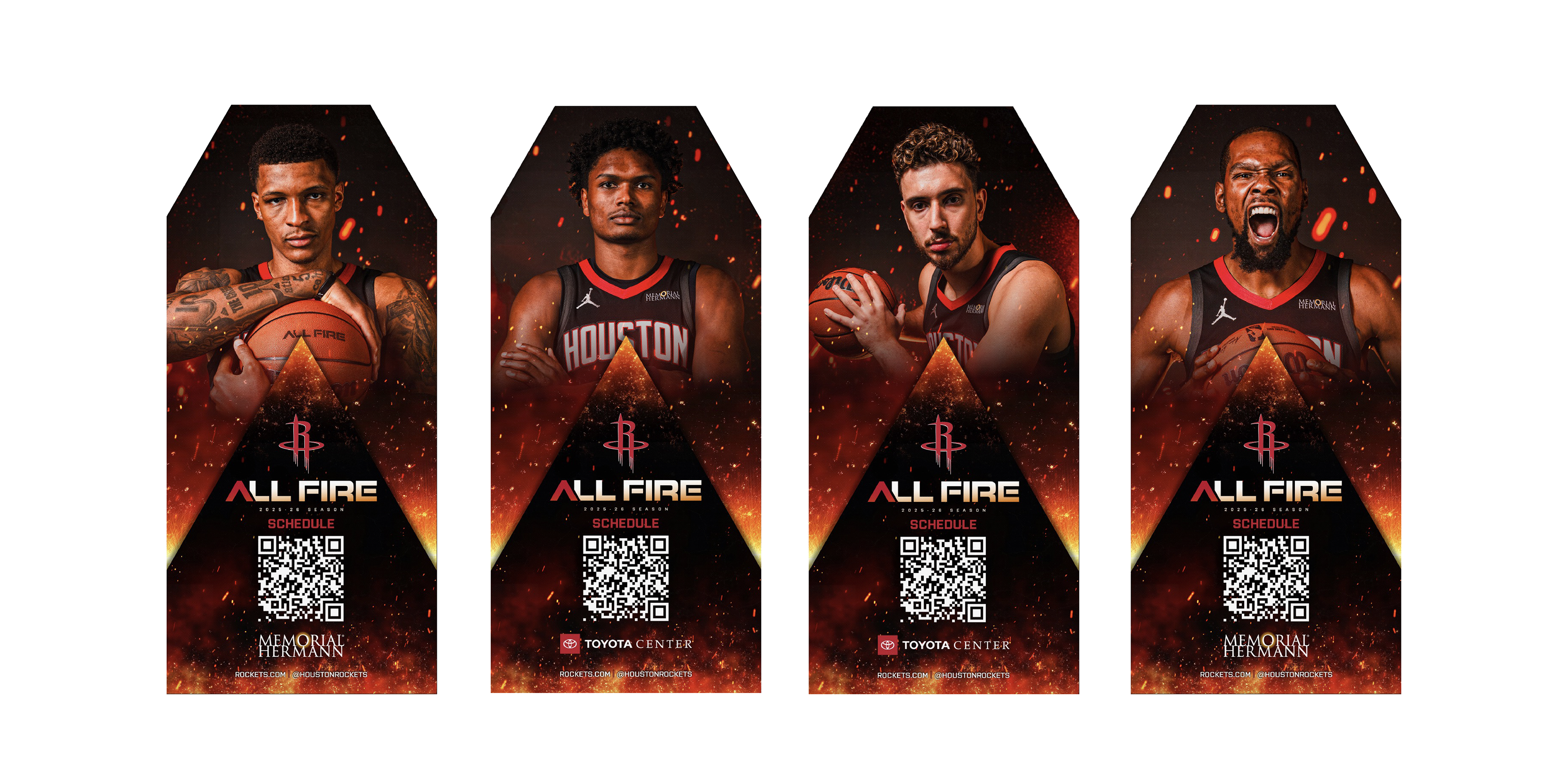
SCHEDULE POSTER & STANDS
POSTERS & MISC